Modern Logos & Marks Collection

A curated collection of modern logos and brand marks crafted for clients across a wide range of industries. Each identity is rooted in strategic thinking, meaningful symbolism, and refined typography, resulting in distinctive, scalable marks that are simple, memorable, and timeless. This collection showcases our approach to transforming ideas into impactful visual identities that help brands stand out with clarity and purpose.
Modern Logos and Brand Marks

Crafted for clients across a wide range of industries. Each identity is rooted in strategic thinking, meaningful symbolism, and refined typography, resulting in distinctive, scalable marks that are simple, memorable, and timeless.

This collection showcases our approach to transforming ideas into impactful visual identities that help brands stand out with clarity and purpose.
Logo-Collection-1

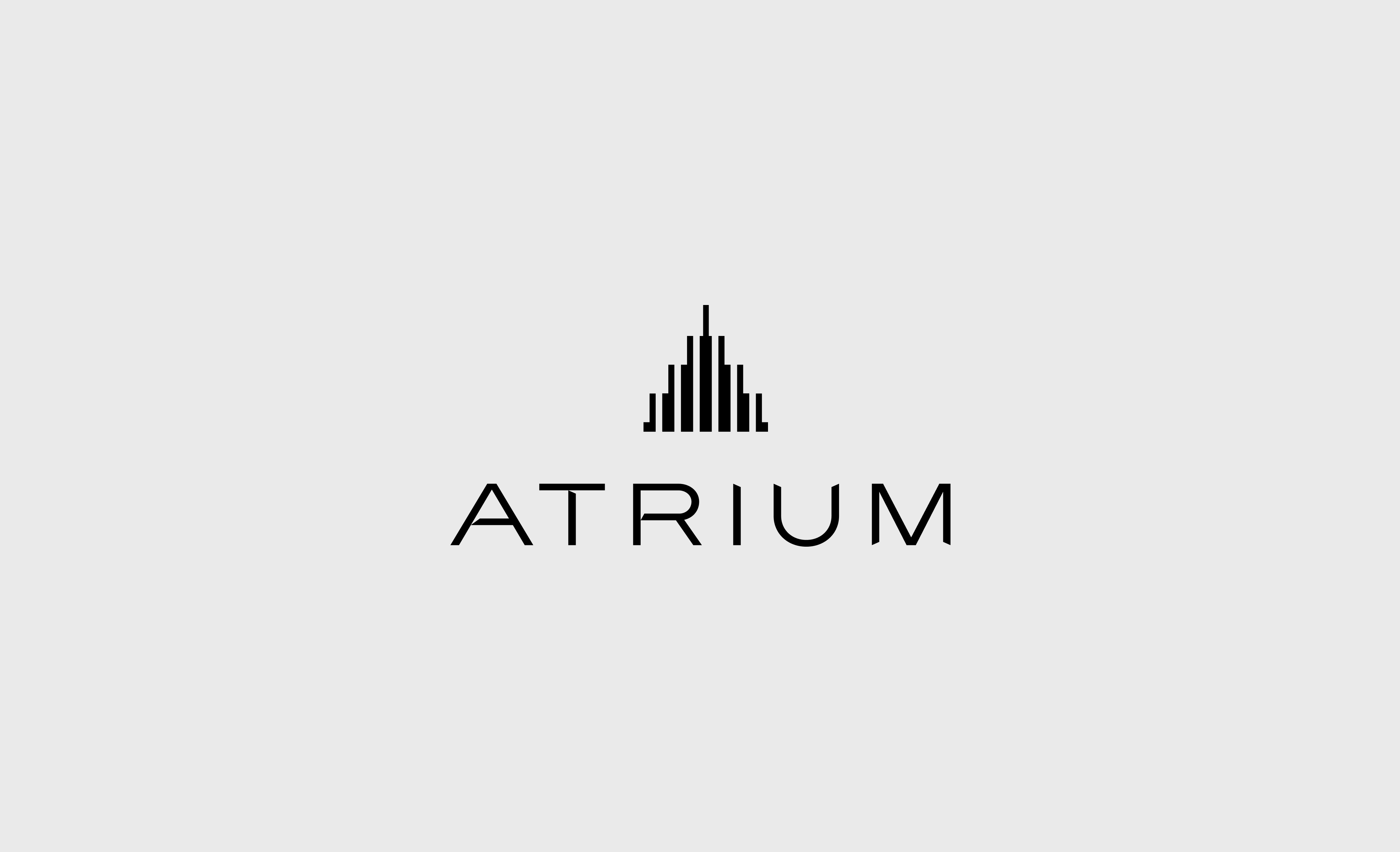
Atrium

REAL ESTATE & MORTGAGE

Inspiration from modern residential architecture through a clean, geometric mark that subtly resembles both a contemporary building and an open atrium.

The ascending vertical forms communicate growth, structure, and urban living, while the refined typography reinforces a premium yet approachable identity.

Together, the mark and wordmark capture the project’s modern, youthful, and design-focused character for today’s professionals.

Logo-Collection-3

Grit

CONSTRUCTION

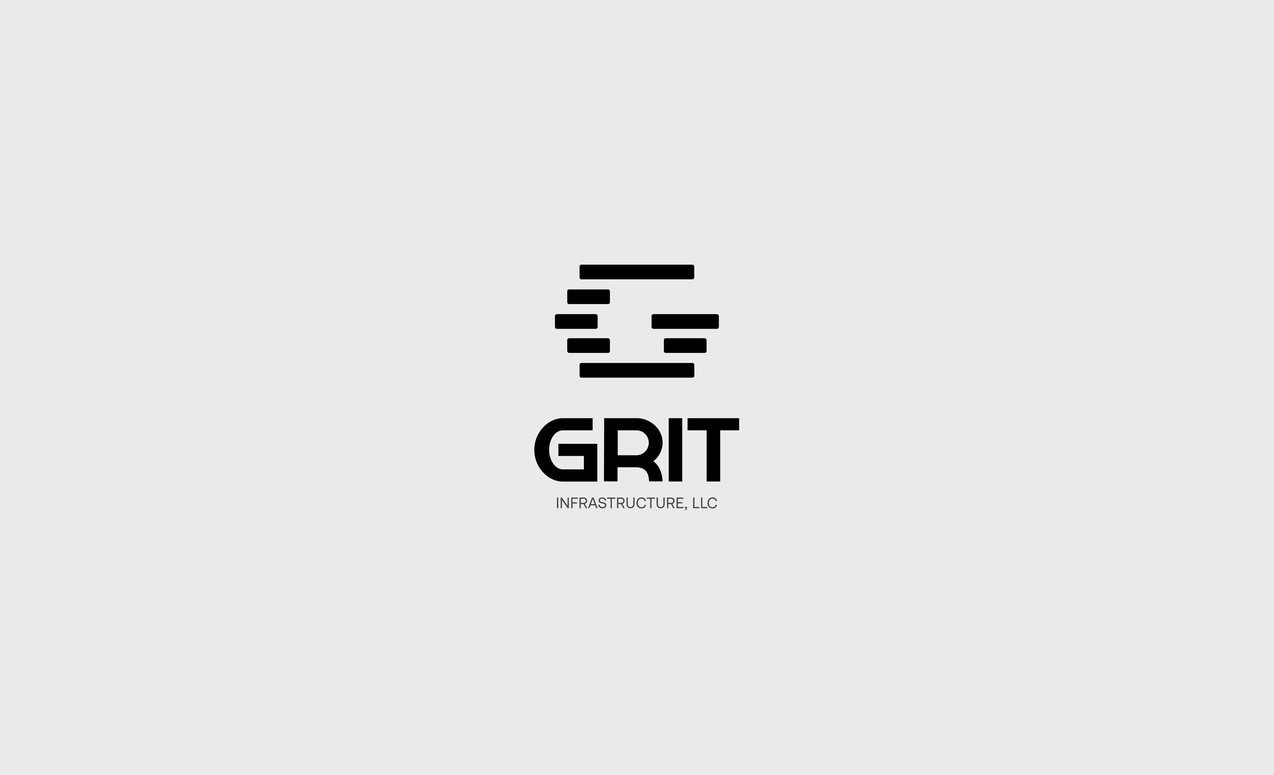
A bold and scalable brand identity created for GRIT Infrastructure, a long-term infrastructure holding company.

The custom symbol is designed to subtly convey a building structure through stacked architectural forms, representing strength, stability, growth, and interconnected infrastructure systems. Paired with a strong custom wordmark, the identity reflects reliability, permanence, trust, and the hardworking values of the Midwest while providing a flexible foundation for a growing family of operating companies.

Logo-Collection-4

Abbey Partners

BUSINESS & CONSULTING

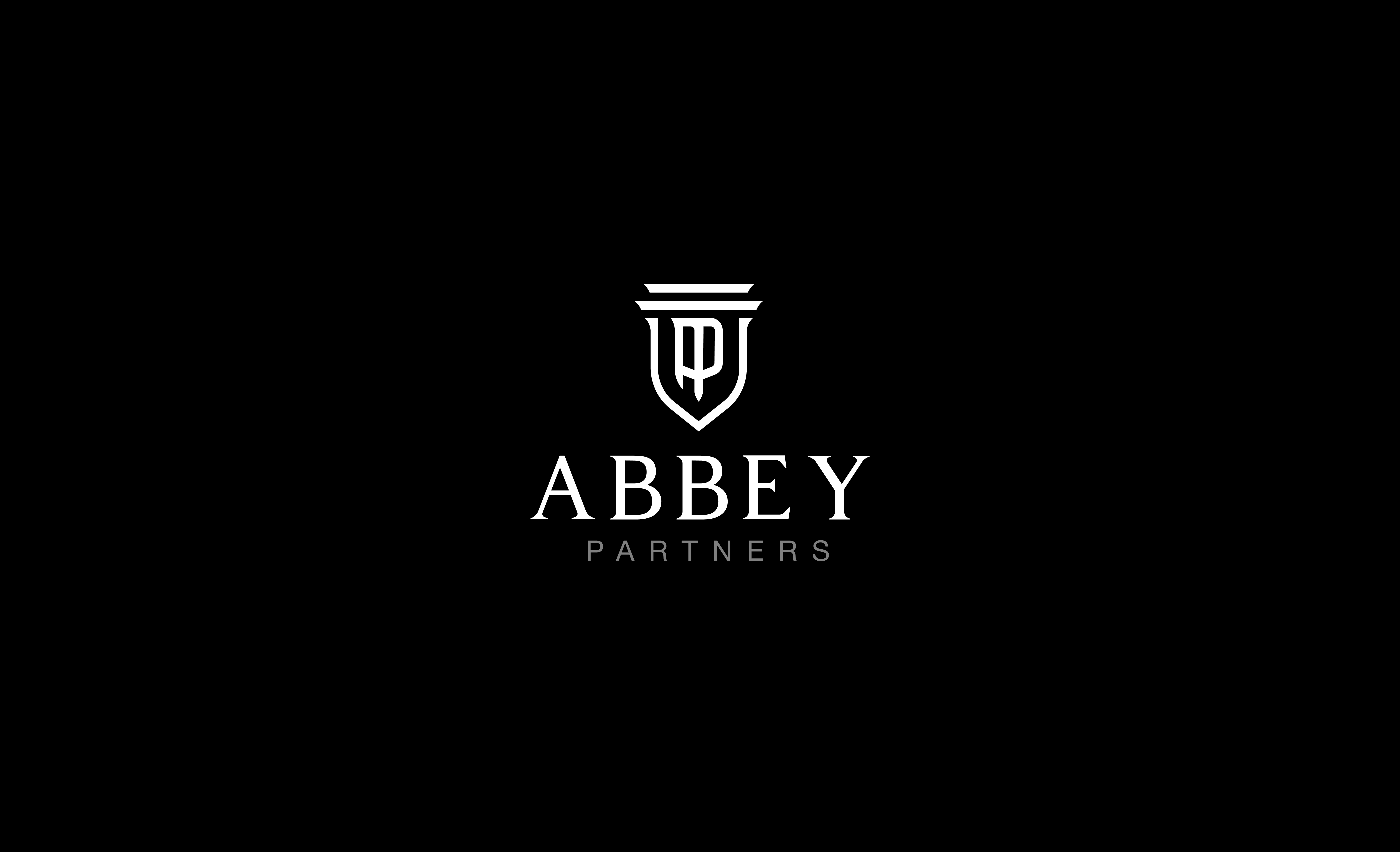
A sophisticated monogram logo designed for Abbey Partners, a legal recruiting and consulting firm.

The custom mark combines the letters A and P within a shield-inspired emblem, symbolizing trust, partnership, protection, and professional excellence. Classical architectural elements and refined typography reinforce the firm’s reputation for connecting top legal talent with leading law firms.

Logo-Collection-5

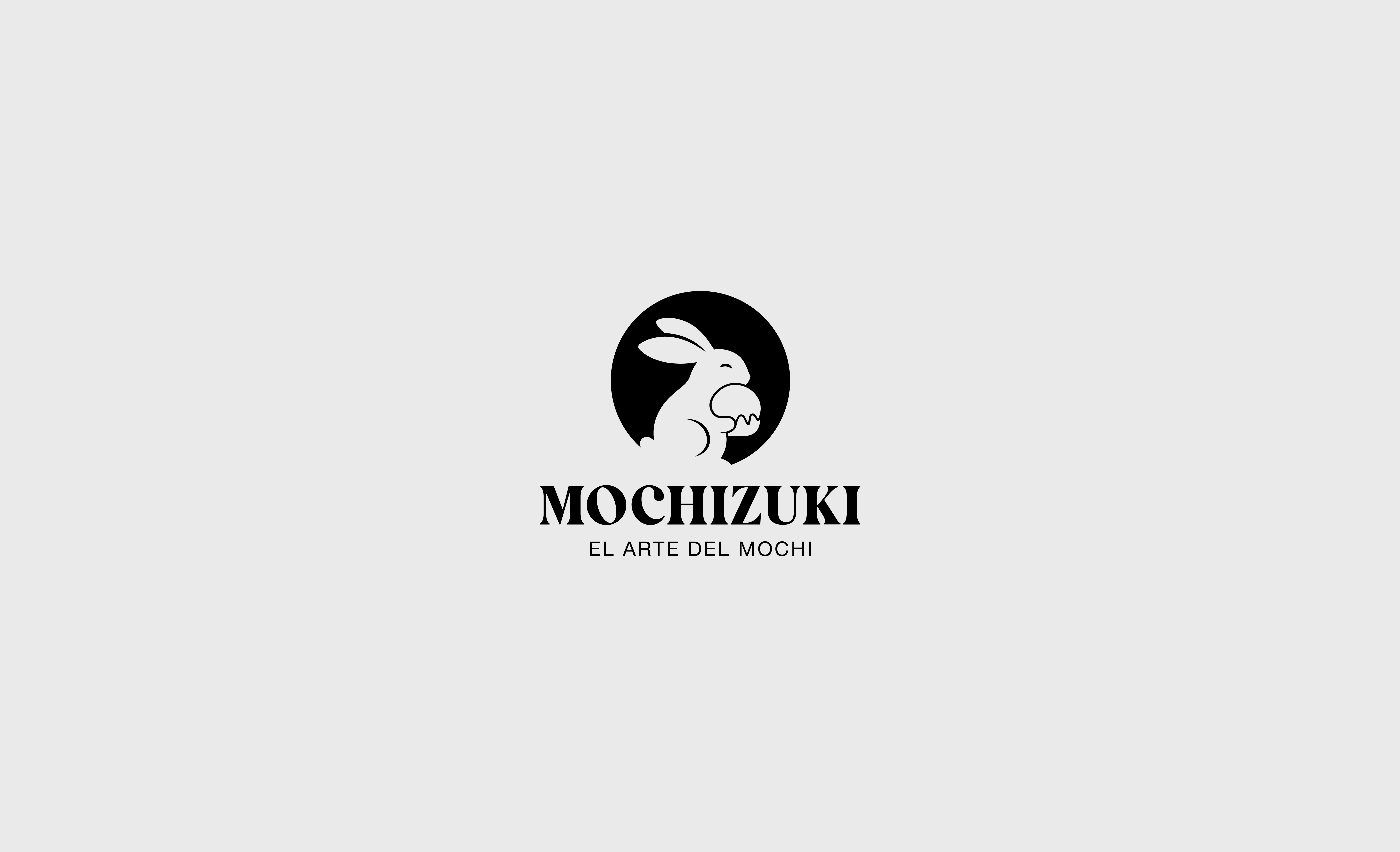
Mochizuki

FOOD & DRINK

Mochizuki is a premium artisanal mochi ice cream brand inspired by the Japanese word Mochizuki (望月), meaning full moon. The identity is built around the poetic connection between a perfectly round moon and the shape of a handcrafted mochi, creating a symbol that feels both timeless and meaningful.

The logo combines a refined lunar-inspired circle with a minimalist rabbit silhouette, referencing the Japanese folklore of the moon rabbit making mochi. A restrained palette of indigo, cream, gold, and seal red reinforces the brand’s premium positioning while maintaining a sense of warmth, craftsmanship, and authenticity.

Designed to scale seamlessly from luxury dining menus and packaging to social media avatars and retail freezer shelves, the identity balances Japanese heritage, modern simplicity, and artisanal quality in a memorable and iconic mark.

Logo-Collection-6

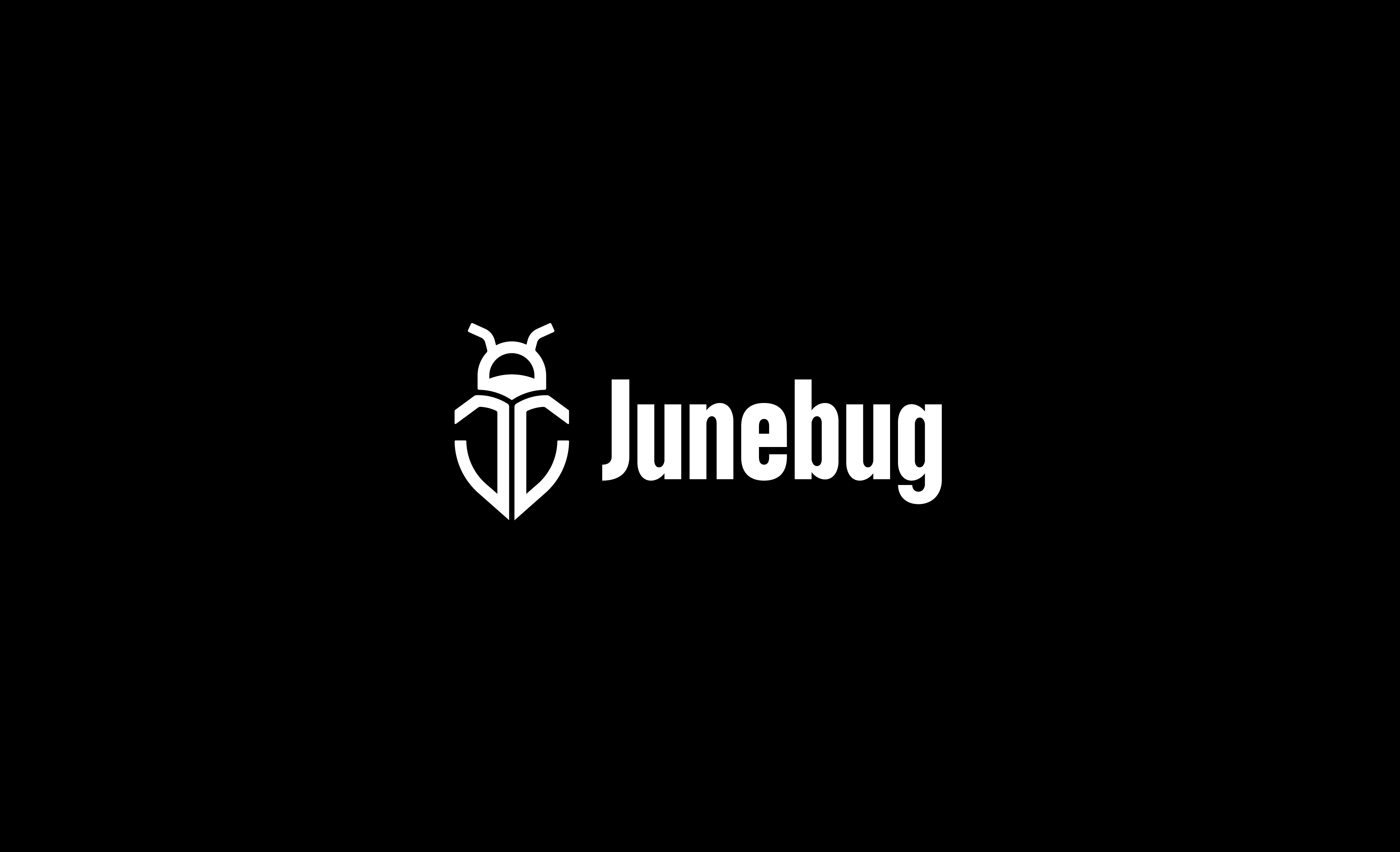
Junebug

FASHION

Junebug is a contemporary women’s swimwear and activewear brand positioned at the intersection of fashion and performance.

The identity was designed to reflect confidence, modern femininity, and effortless sophistication through a refined wordmark and a distinctive standalone symbol inspired by the brand name. Balancing editorial elegance with functional versatility, the logo system is crafted to perform seamlessly across apparel, packaging, digital platforms, and garment applications.

Logo-Collection-7

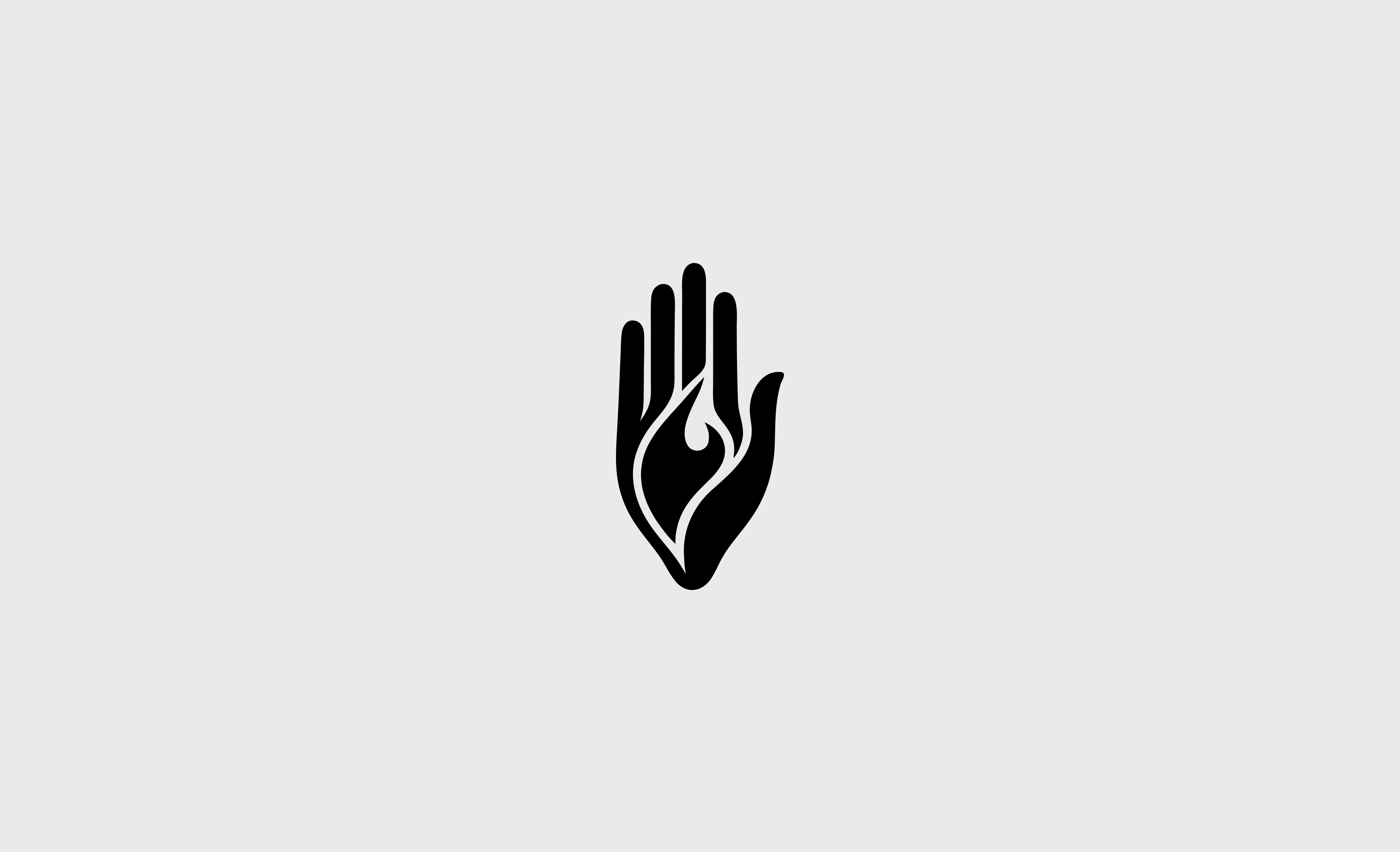
Hand of Fire

SPA & ESTHETICS

A brand in the wellness and spirituality space. The client provided a reference image of a Hamsa-inspired hand with organic, flowing lines and asked for a custom interpretation that combined the protective symbolism of the Hamsa with the energy of a flame.

I explored eight concept directions ranging from monochrome negative-space treatments to two-tone color approaches. The final approved design features a taupe hand cradling a vivid orange flame, with the hand’s shape naturally forming and containing the fire element. The mark reads clearly at all sizes and works in full color, single color, and reversed applications.

Logo-Collection-8

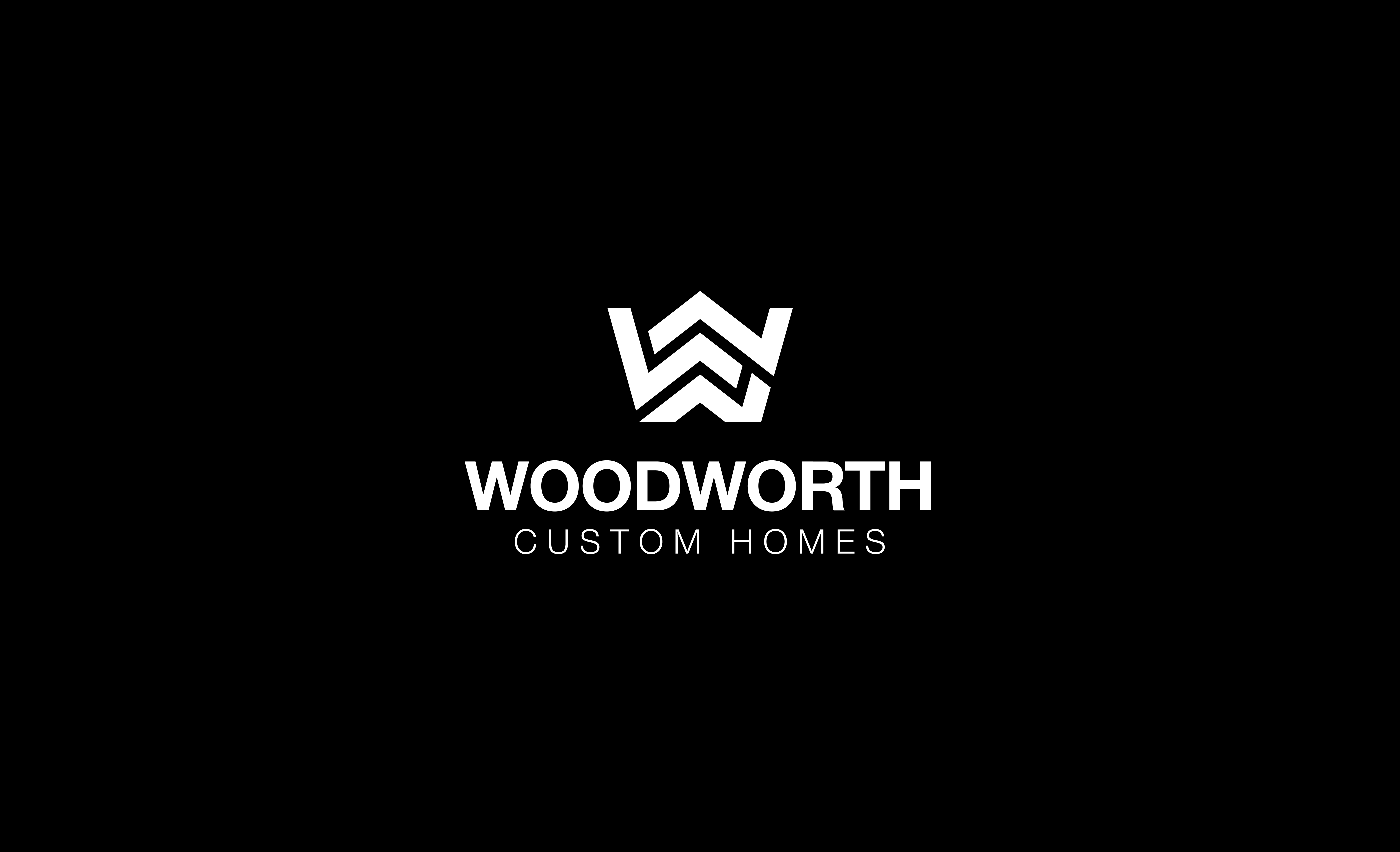
Woodworth Custom Homes

CONSTRUCTION

Woodworth Custom Homes is a family-owned custom home builder focused on quality craftsmanship, thoughtful design, and personalized service.

The logo combines a custom W monogram with a subtle home/roof symbol, seamlessly integrated into a single geometric mark.

Logo-Collection-9

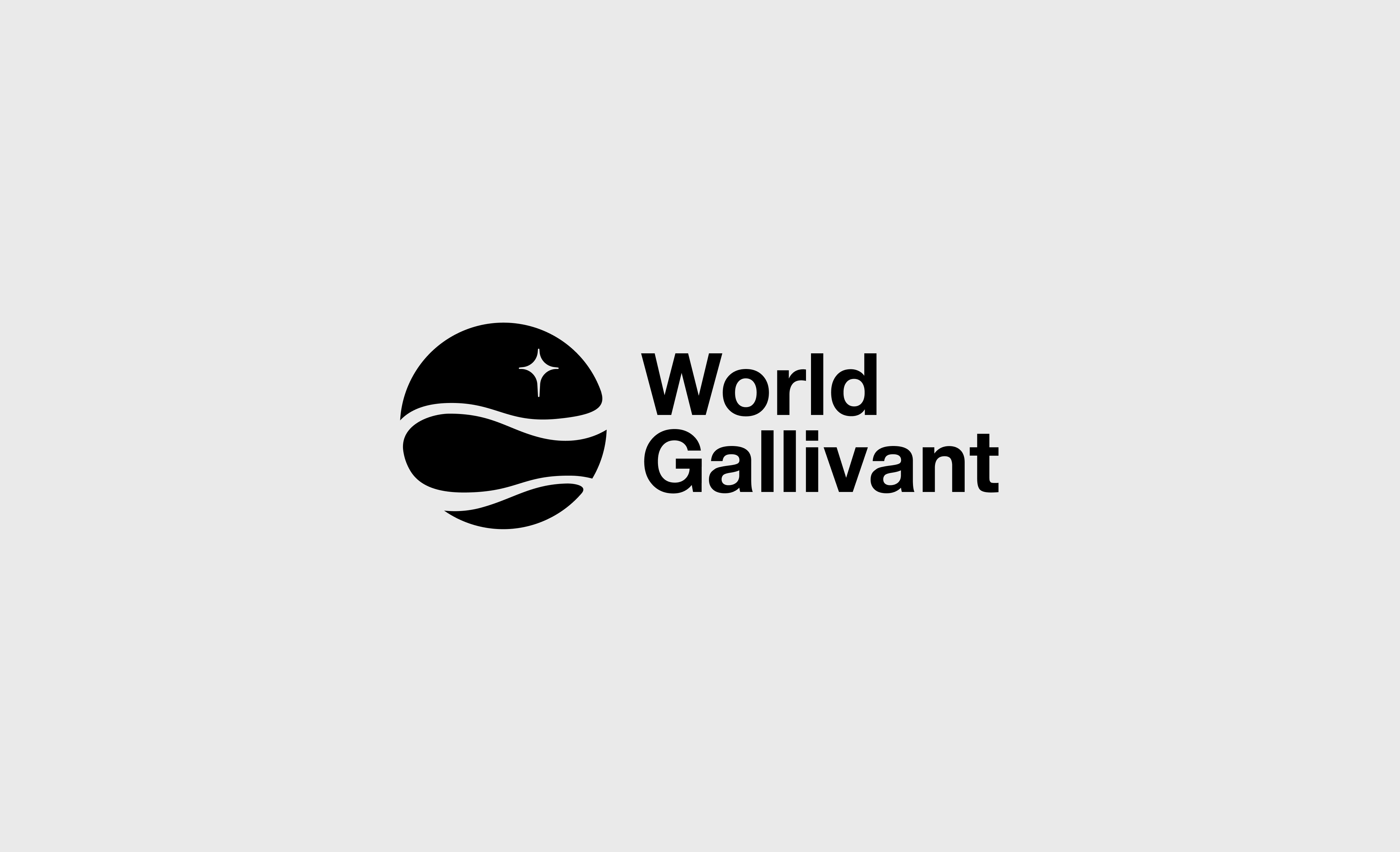
World Gallivant

TECHNOLOGY

Designed to embody the spirit of exploration, discovery, and global travel through a clean and contemporary visual identity.

The circular emblem represents the world, while the flowing paths that traverse the sphere symbolize journeys, movement, and the endless adventures that connect people, cultures, and destinations across the globe. Together, these elements create a distinctive mark that reflects curiosity, freedom, and the excitement of discovering what lies beyond the horizon.

Logo-Collection-10

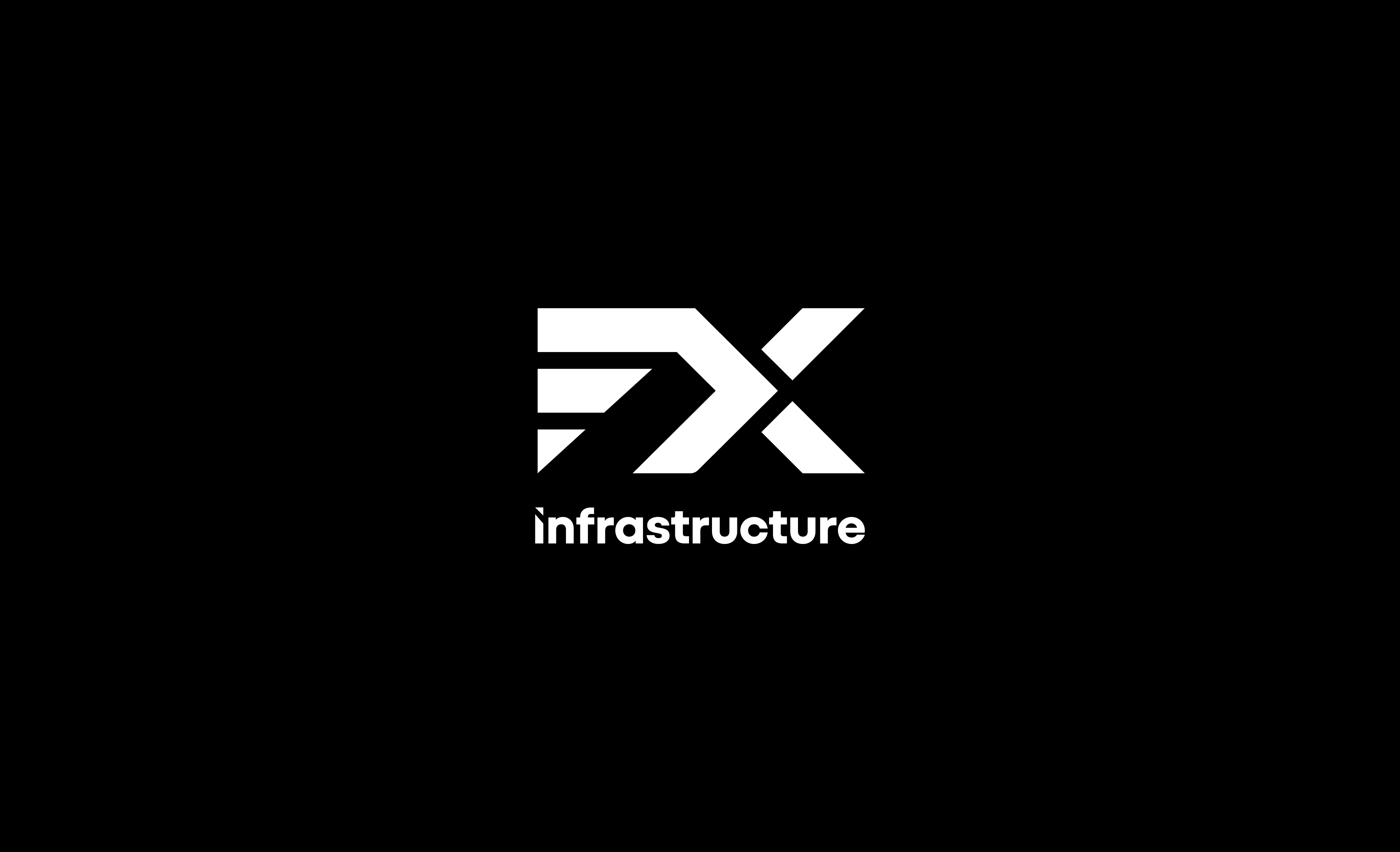
FX Infrastructure

CONSTRUCTION / INFRASTRUCTURE

Built around a bold geometric monogram that merges the letters F and X into a distinctive, forward-moving symbol.

Its angular forms convey structural strength, connectivity, and progress, reflecting the company’s commitment to building reliable infrastructure. Paired with a clean, modern wordmark, the identity creates a confident and timeless brand presence.

Logo-Collection-11

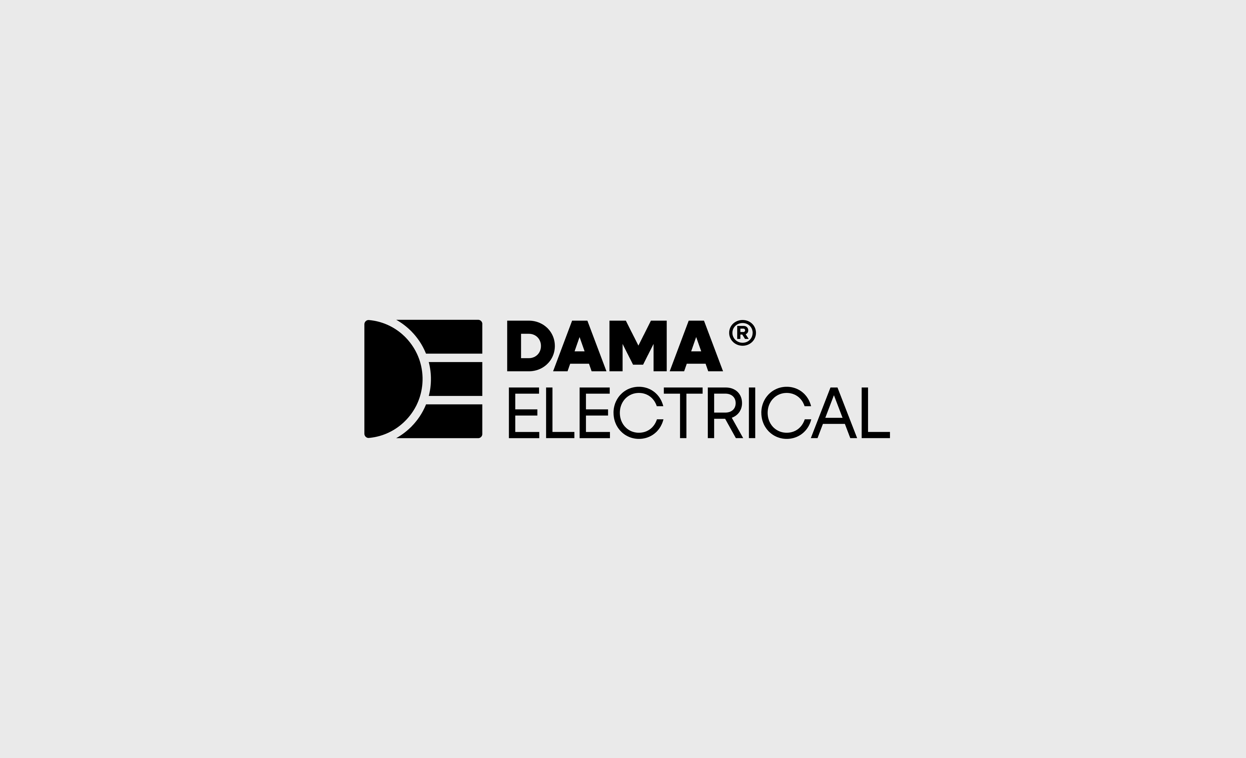
Dama Electrical

CONSTRUCTION

DAMA Electrical is centered around a bold custom monogram that seamlessly combines the letters D and E, creating a distinctive symbol representing electrical flow, connectivity, and reliability.

Its clean geometric construction reflects precision, strength, and technical expertise, while the modern typography reinforces a professional, trustworthy identity for residential and commercial electrical services.

Logo-Collection-12

AdNerds

BUSINESS & CONSULTING

AdNerds combines bold typography with a paper airplane seamlessly integrated into the wordmark, representing the movement of ideas, advertising, and digital communication.

The distinct treatment of “ad” and “NERDS” creates a clear visual hierarchy, while the playful icon adds personality without relying on literal “nerd” clichés. The result is a memorable, modern identity that reflects creativity, marketing expertise, and an approachable brand for online entrepreneurs.

Modern Logos & Marks Collection

Related Projects

See Related Projects
Custom Design Services

Need Something Made Just for You?

Our ready-made assets are just the beginning. Our design team creates custom illustrations, icons, stickers, and animations built specifically for your brand.

Custom Design Services CTA Illustration